SAKHEN App
Brand Identity, Brand Strategy, Package Design, Art Direction
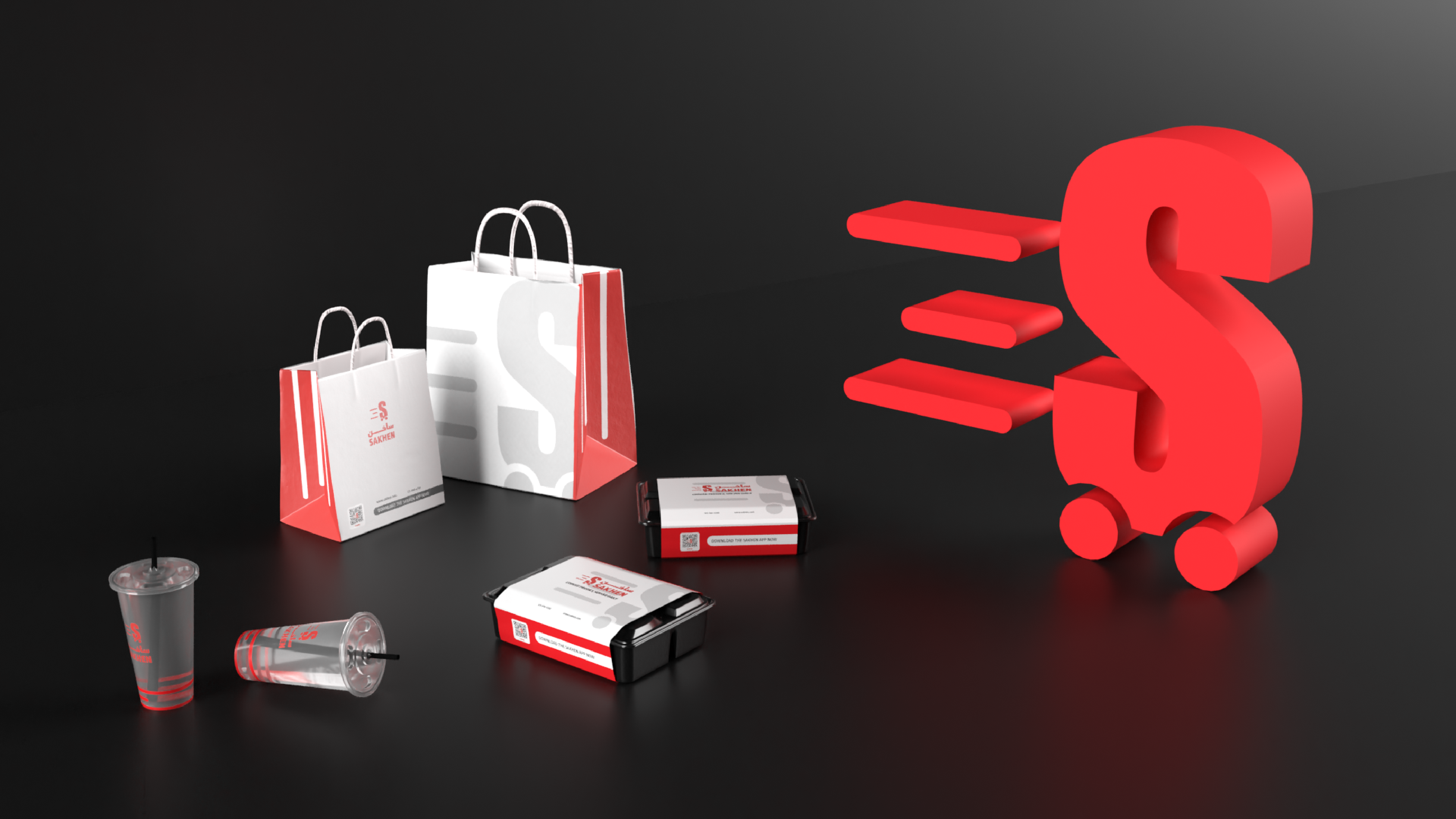
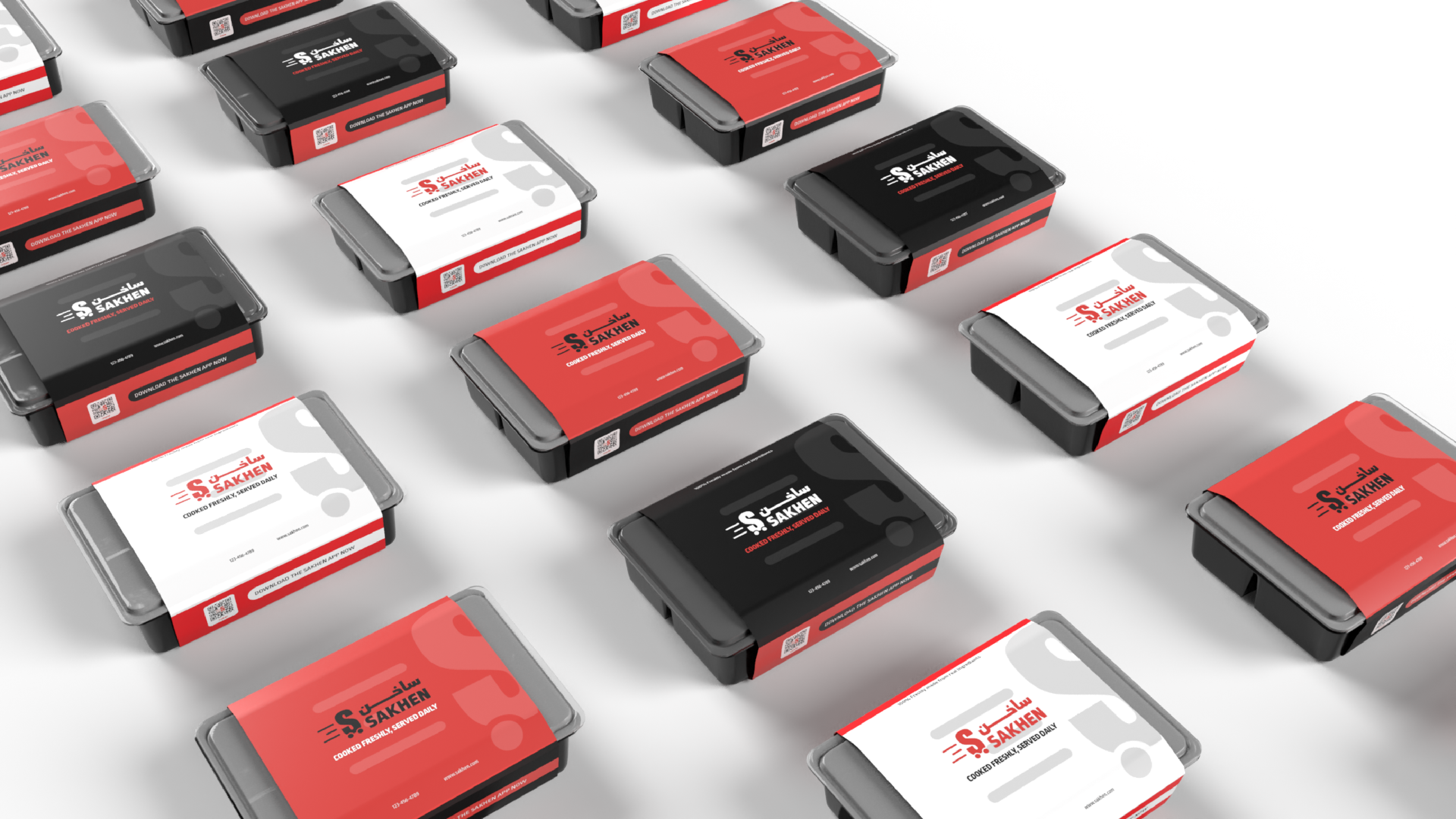
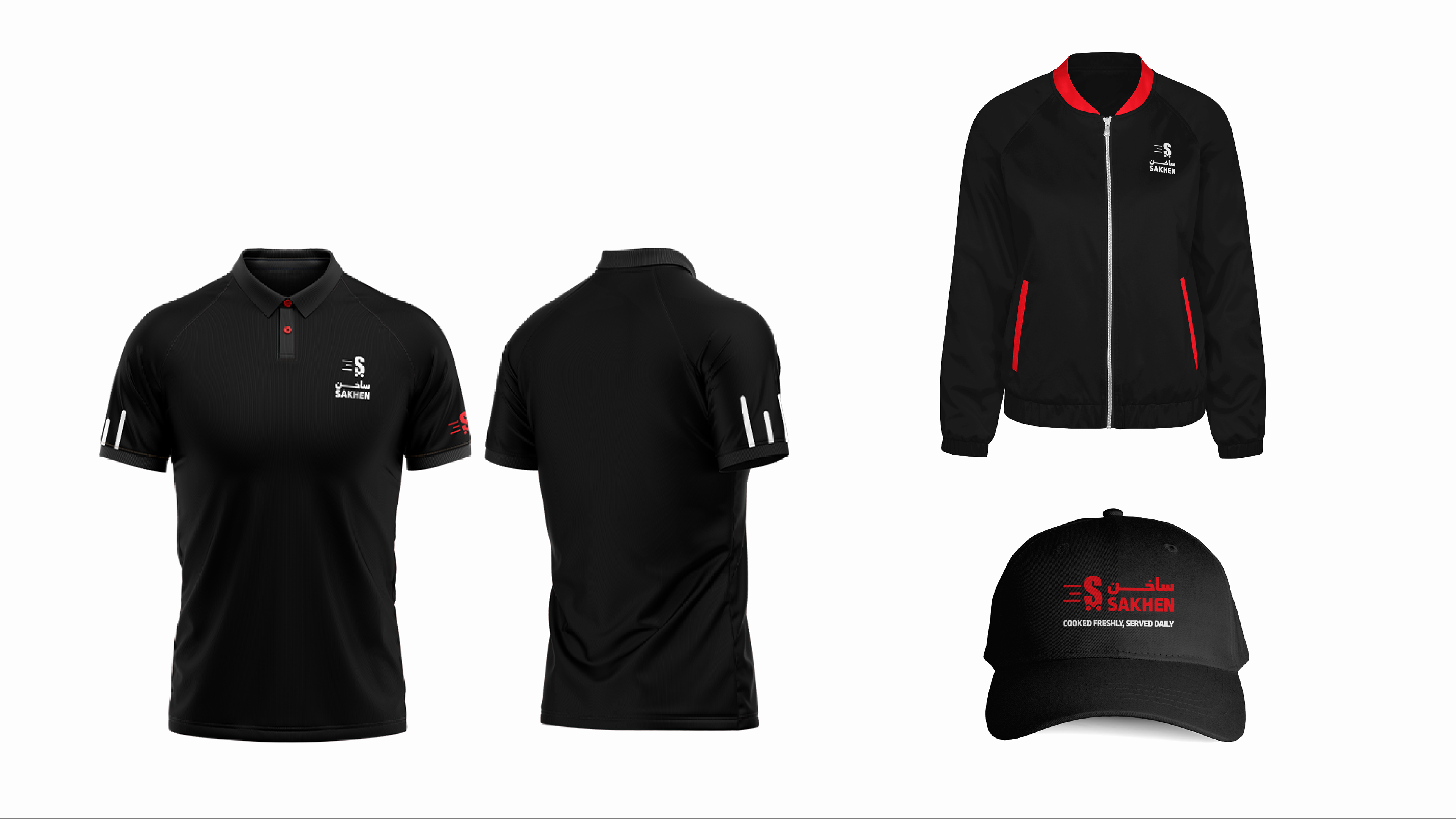
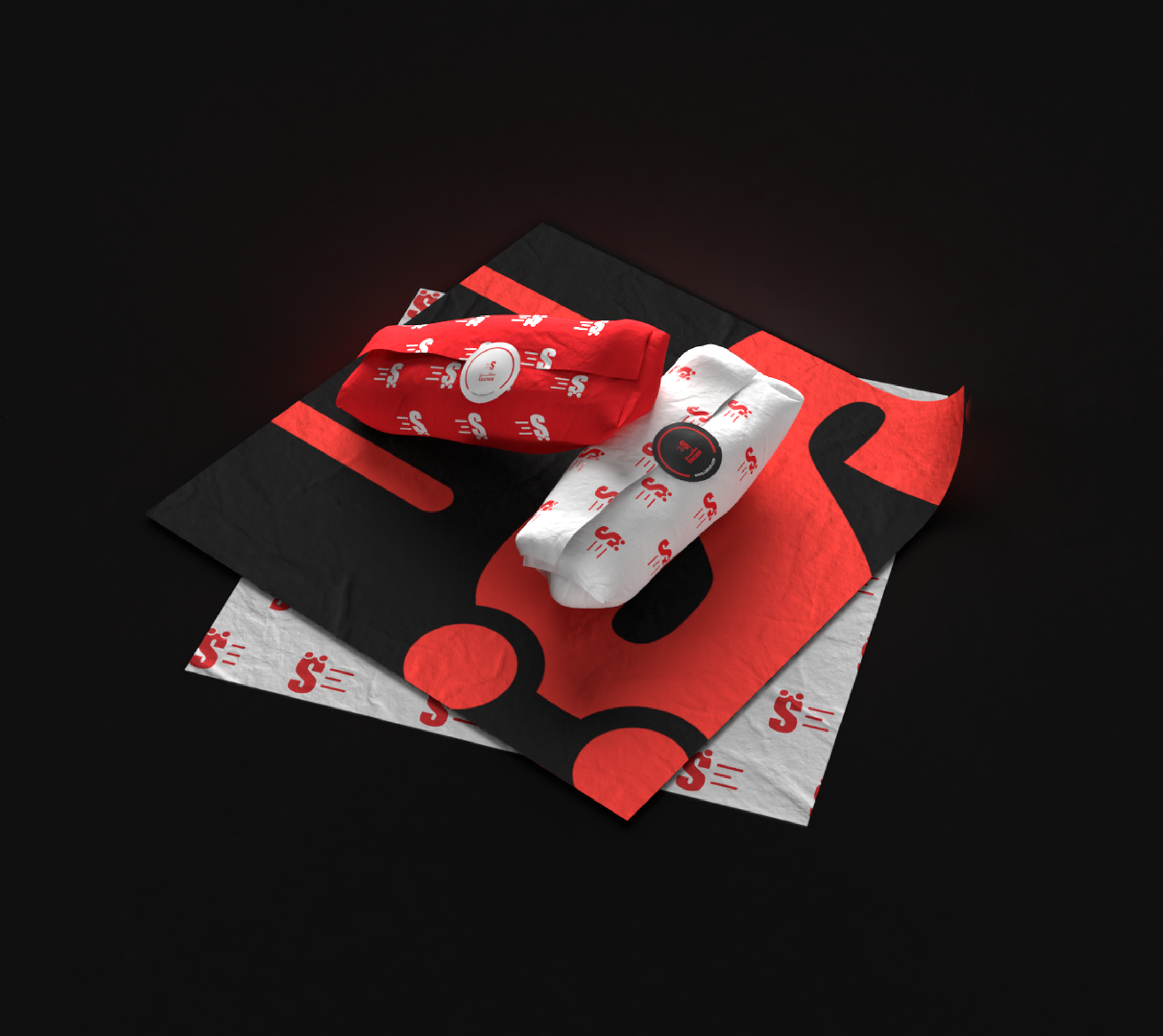
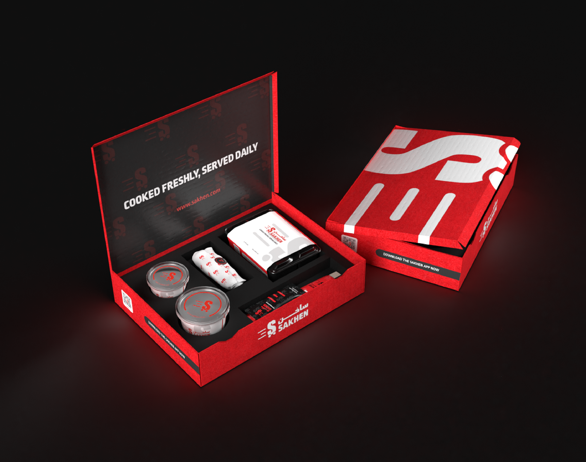
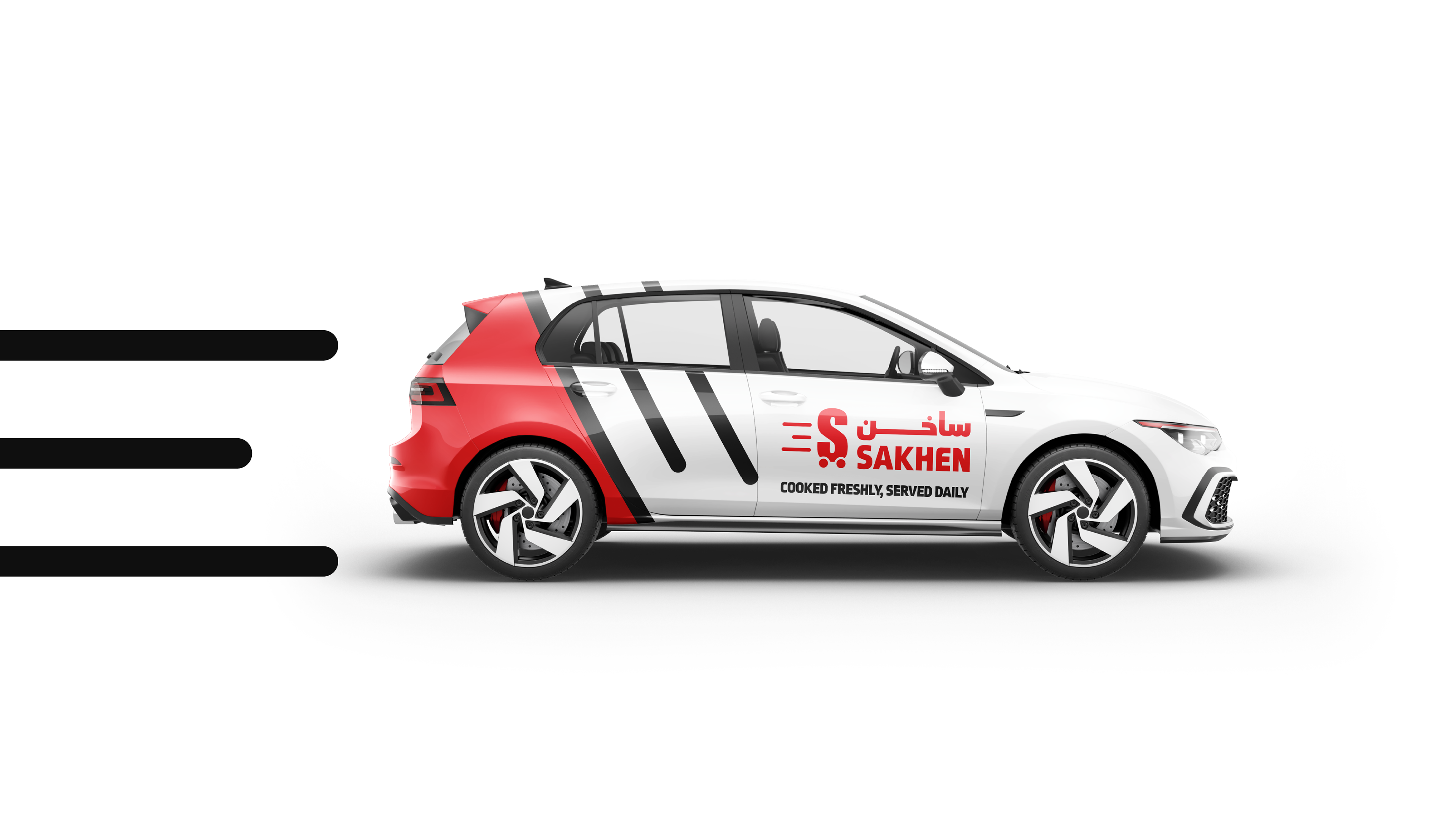
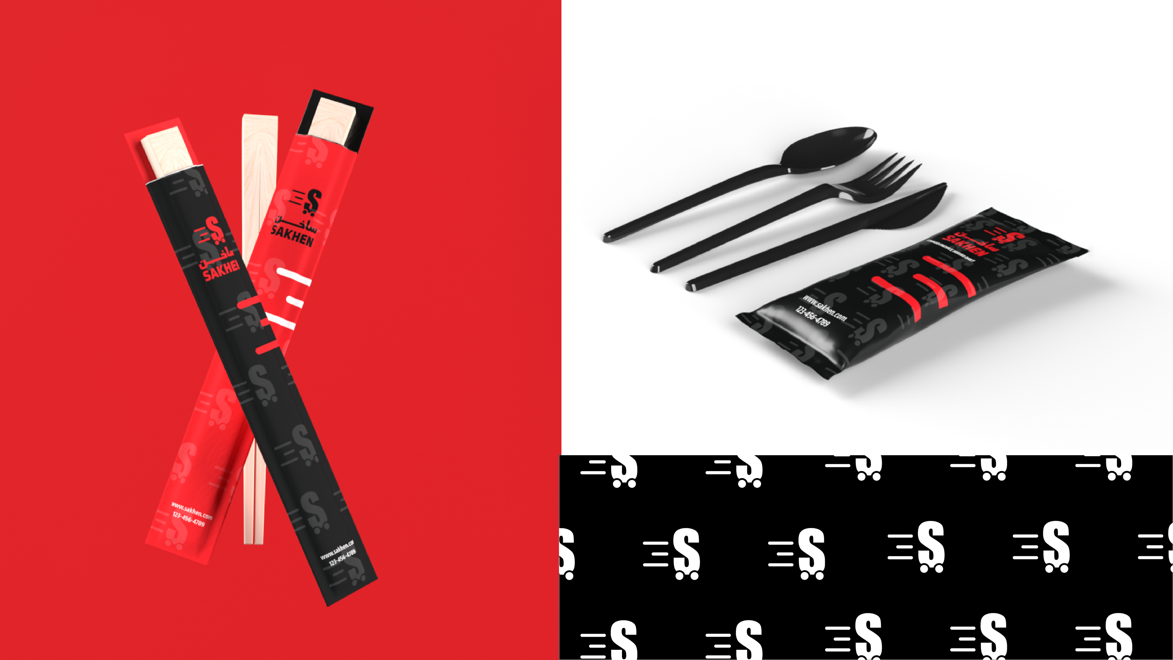
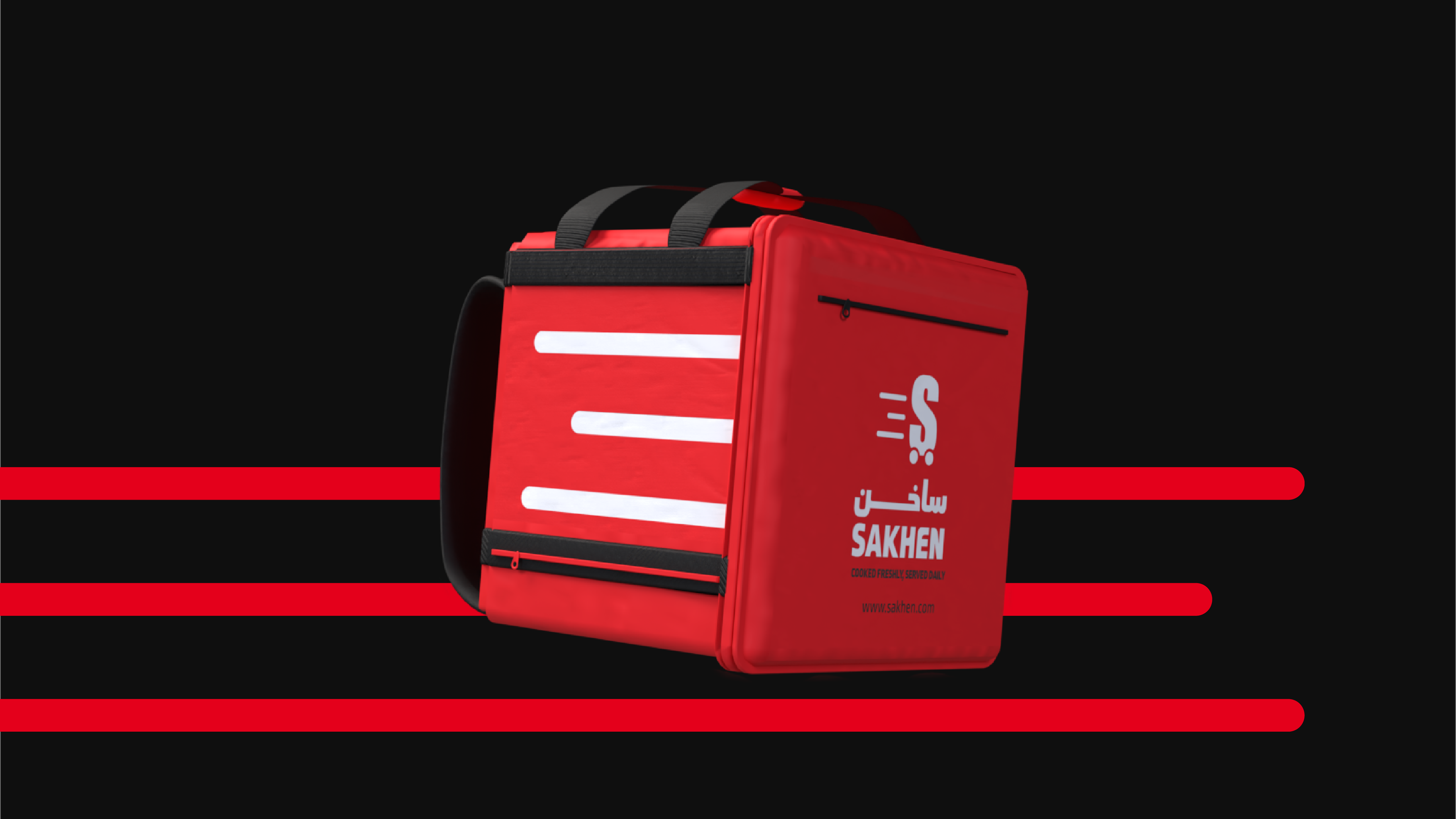
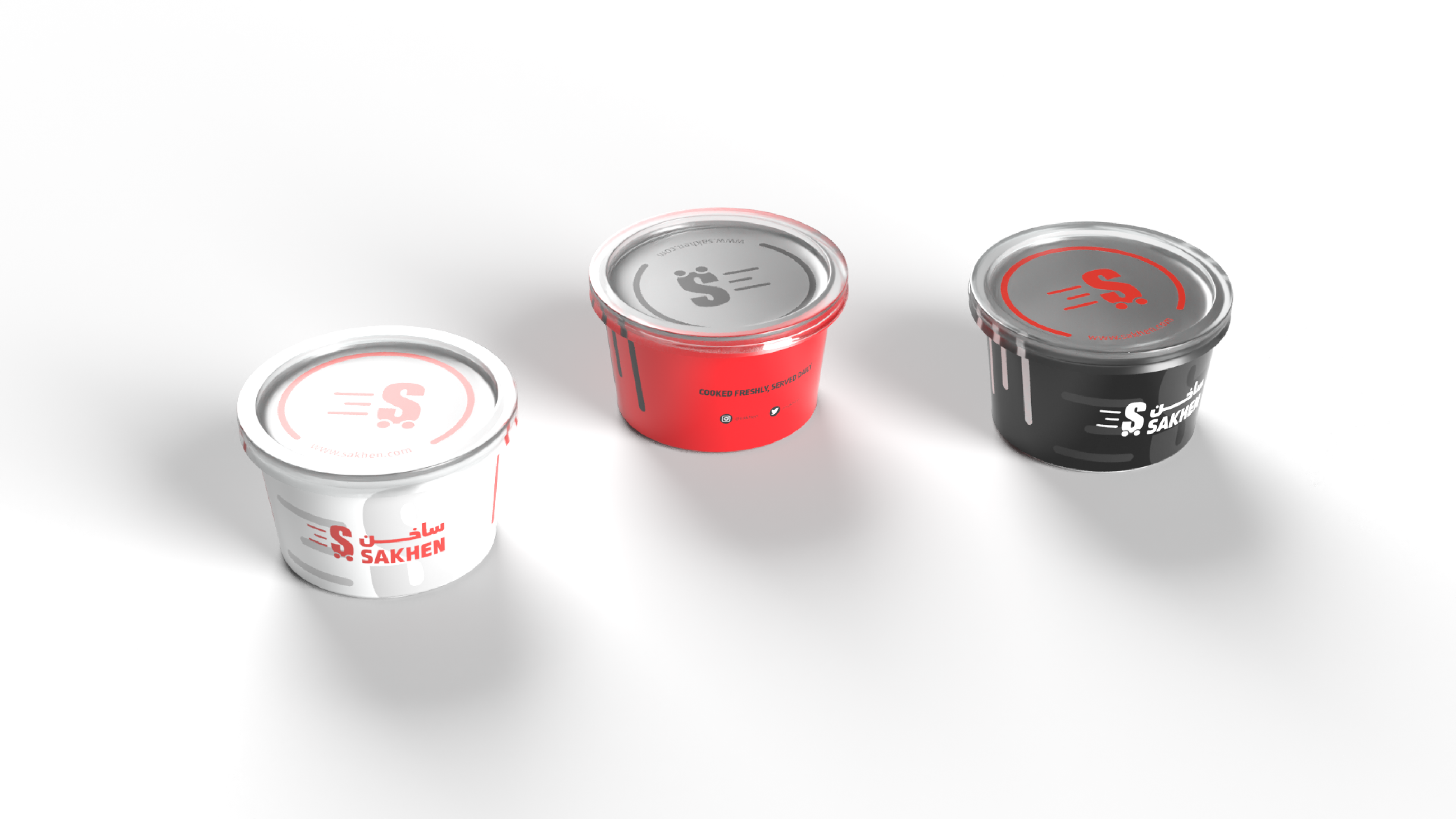
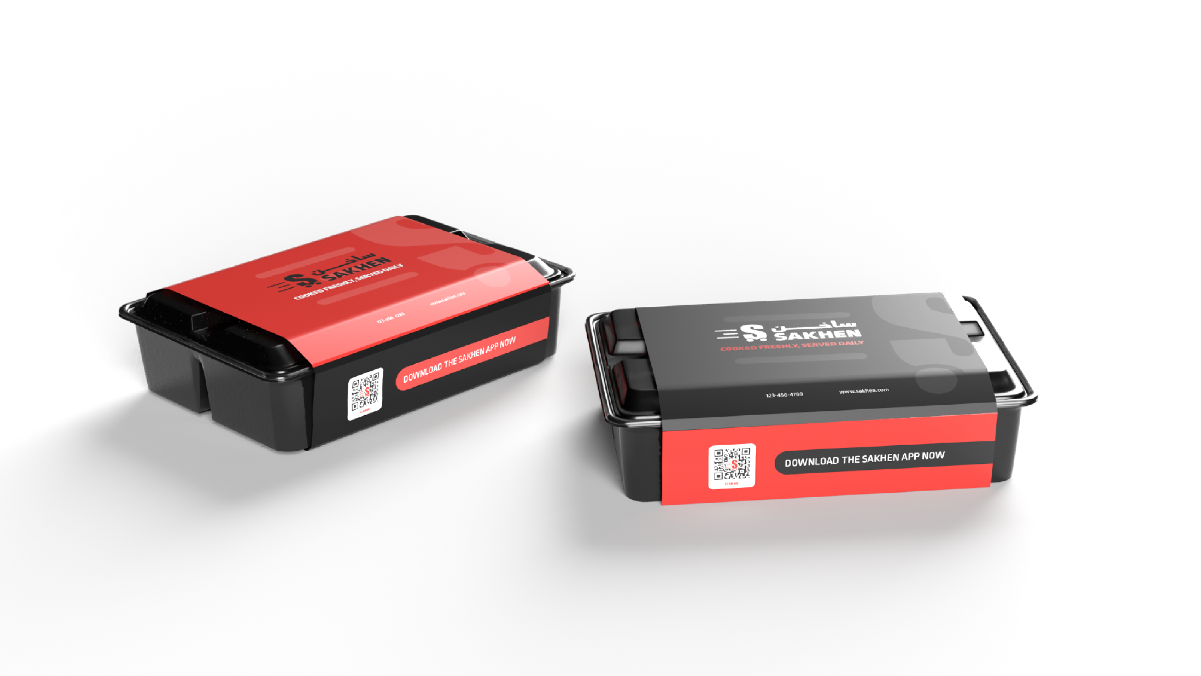
Introducing the Sakhen app - your friendly neighborhood chef, delivering happiness one meal at a time. At Sakhen, they believe that food is more than just sustenance; it's a celebration of flavor and connection. Our brand identity reflects this belief, radiating warmth, approachability, and a dash of culinary charm. The logo for Sakhen, featuring the Arabic word "ساخن" meaning "Hot" and "Warm", perfectly encapsulates our commitment to speedy service and delivering meals that are hot and ready to eat. With its sleek design and dynamic lines, the logo conveys a sense of movement and efficiency, symbolizing the swift delivery of delicious food straight to your door. Paired with our playful color palette, every element of Sakhen is designed to make you feel right at home. Whether you're craving a comforting bowl of soup or a hot, delicious meal, Sakhen has you covered with a menu that's as diverse as it is mouthwatering. Join us on a journey where convenience meets community, and every meal is served with a side of smiles. Welcome to Sakhen - where good food and good vibes come together in the heart of Saudi Arabia.