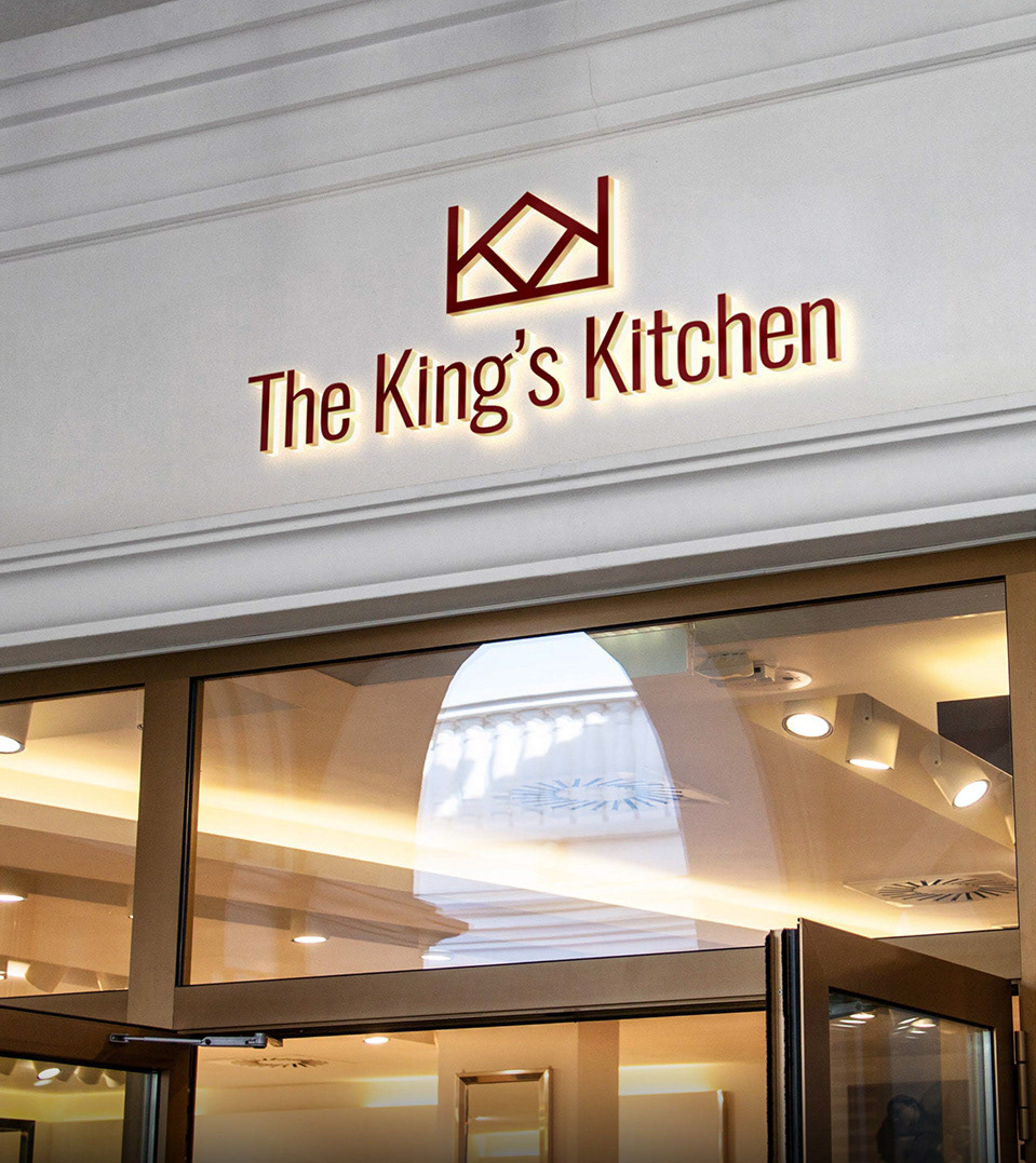
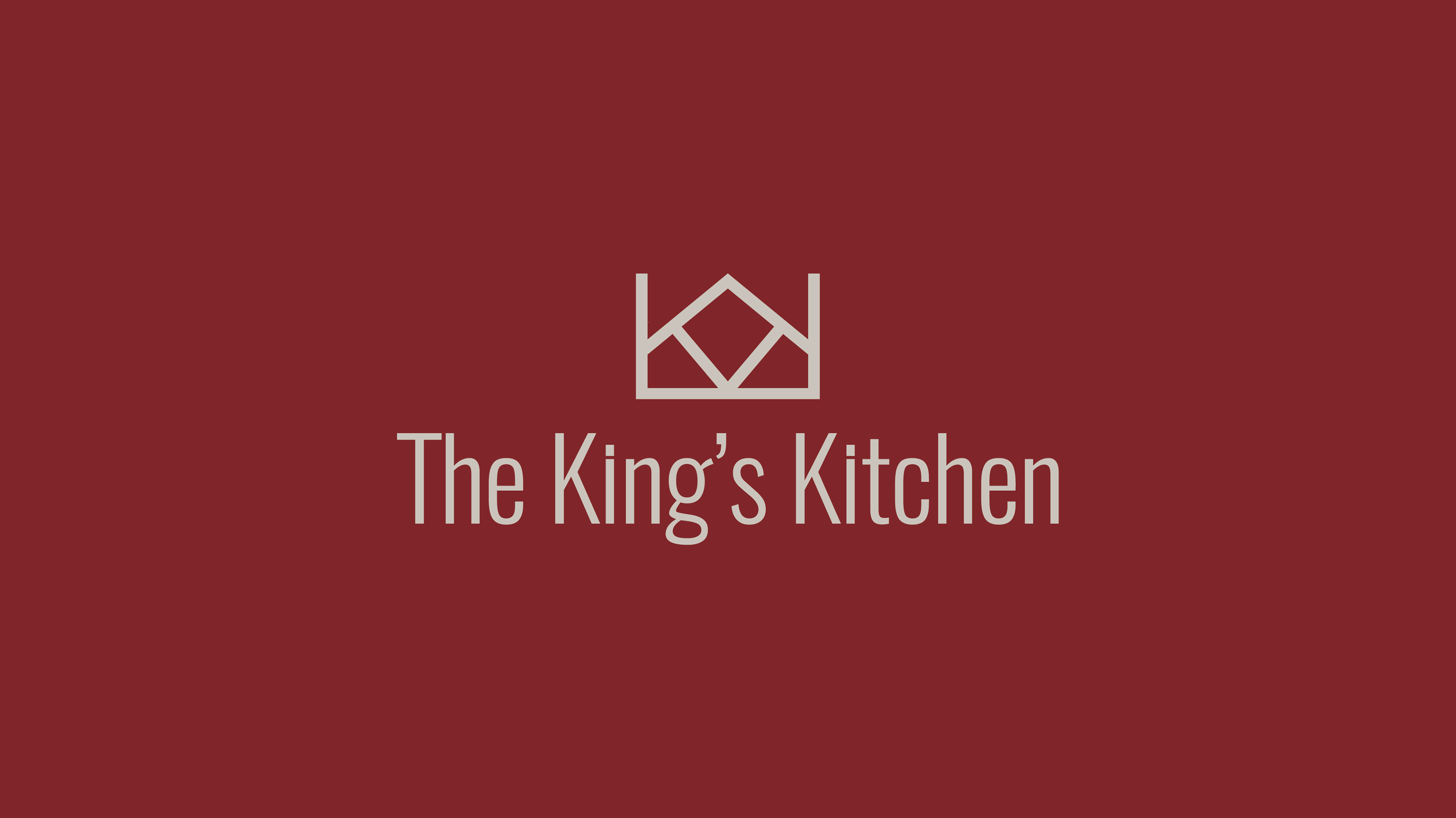
The King's Kitchen
Brand Identity, Animation, Logo design, Package Design, Art Direction
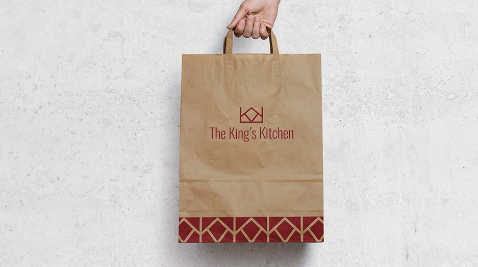
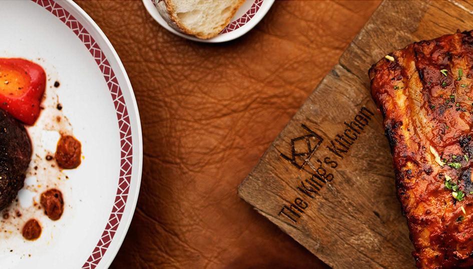
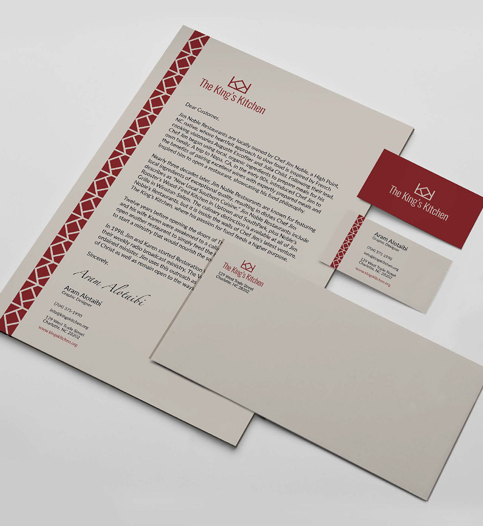
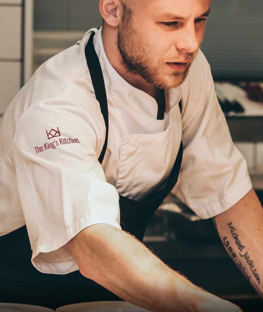
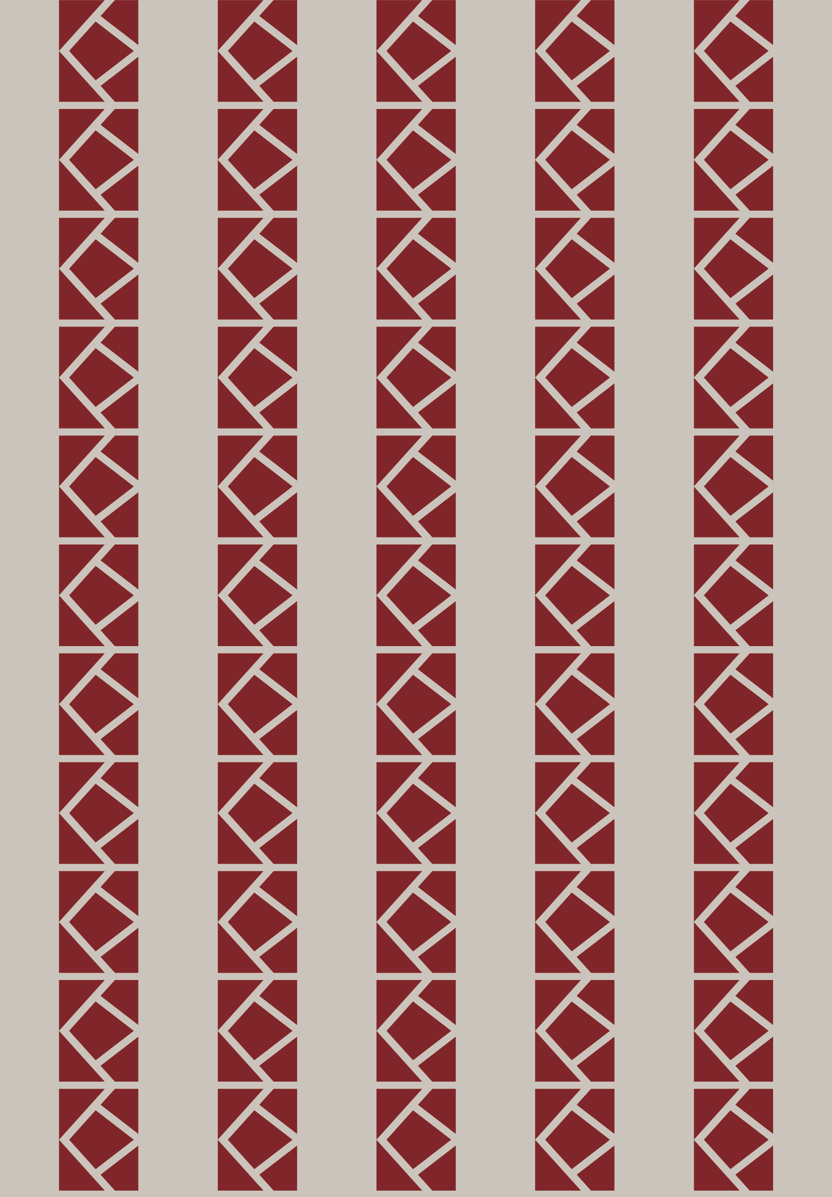
Introducing The King's Kitchen – a rebrand concept where the essence of royalty meets culinary excellence. They are dedicated to providing high-quality dining experiences, ensuring that every bite reflects their commitment to excellence. At The King's Kitchen, customer satisfaction is paramount, offering an authentic and luxurious atmosphere to savor their delectable offerings. Drawing inspiration from regal motifs, I meticulously crafted the brand identity, logo, and package design to embody the grandeur of royalty. The crown symbol, representing regal authority, is intertwined with the initials "K.K." for The King's Kitchen. Red, the color of regal majesty and power, dominates our palette, evoking a sense of prestige. The patterns derived from the crown icon further accentuate our regal style, creating a visual language that speaks of opulence and grandeur. Welcome to The King's Kitchen, where every detail reflects the noble heritage of its name.